
Performance Reporting for Learning Platforms

You can have every export, every dashboard, and every monthly review in place and still miss the point if the report doesn't tell each reader what to do next. That's the trap many learning teams fall into, especially when the LMS, video platform, and spreadsheet all say something slightly different and nobody wants to own the interpretation.
In practice, the problem isn't a lack of data. It's that educators, L&D managers, IT teams, and senior leaders rarely need the same view, so a single catch-all report usually becomes too broad for action and too narrow for trust.
Why Most Performance Reports Fail Educators
A programme lead opens a dashboard on Monday morning and sees completion rates, session attendance, video views, assessment scores, and half a dozen technical indicators. Nothing looks obviously broken, but nothing feels clearly healthy either, so the team spends the meeting debating what the numbers mean instead of deciding what to change. That's the everyday failure mode of performance reporting in learning environments, too much information, not enough direction.
The issue usually starts with design. Reports are built to prove activity, not to support decisions, so they pile up metrics without clarifying ownership, target, or context. In universities and corporate training programmes alike, that means people spend time defending the report rather than improving the course.
A better report answers three questions at once, what happened, how does it compare with the target, and what should change next. That is why practical reporting feels closer to a working brief than a summary sheet. If the audience can't decide whether to adjust content, support learners, or escalate a technical issue, the report has failed.
For educators who need help keeping feedback language consistent, automate report card writing is a useful example of how structured outputs can reduce repetitive work. The same principle applies to learning dashboards, standardise the recurring wording, then reserve human time for judgement.
Practical rule: if a metric doesn't drive a decision, it belongs in an appendix, not the front page.
What Performance Reporting Actually Means for Learning Platforms
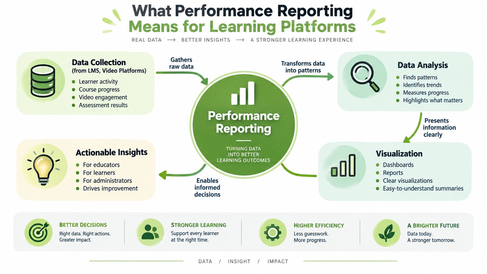
Performance reporting for learning platforms is the discipline of turning raw platform data into a small set of measures that show whether learning activity is moving in the right direction. In the UK public-sector tradition, reporting became more formalised through the Public Service Agreement era and later the Outcome Delivery Plan framework, where departments reported progress against measurable targets rather than narrating activity alone. The result was a reporting pattern that still works well in education and training, define the objective, choose a few KPIs, report variance from target, and explain movement over time. The UK performance measurement tradition is a strong reference point for that shift.
A car dashboard provides a good analogy. You do not need every sensor reading at once; you need speed, fuel, warning lights, and the few indicators that tell you whether to brake, refuel, or pull over. Learning reports should work the same way, especially when an LMS, video platform, and virtual classroom are all generating signals at once.
The structure that makes reports useful
The most useful reports follow the same logic. First, set a clear objective. Then select a small number of KPIs that reflect progress, such as engagement, completion, quality, or technical reliability.
After that, track variance from target and compare current results with previous periods so readers can see direction, not just a snapshot. The UK National Audit Office has stressed that reports should use a small set of meaningful indicators and trend data, because large metric sets can hide whether a programme is improving.
A report that shows movement over time is easier to act on than one that only lists numbers.
The structure also travels well across settings. In a university, the objective might be stronger participation in a module. In a corporate setting, it might be completion of a compliance pathway or successful transfer of a new skill into day-to-day work. The reporting pattern stays the same, but the audience changes, so the interpretation has to change with it.
Core KPIs and Metrics That Drive Learning Outcomes
The wrong KPI mix creates false confidence. A dashboard full of completion counts and page views can look healthy while learners are still dropping out, struggling with content, or hitting technical friction. The right mix separates engagement, quality, and outcome measures so each stakeholder can see what they can influence.
Match KPIs to the decision owner
For course leads, engagement data matters most when it shows where attention rises or falls. That includes completion rates, time spent, interaction frequency, and assignment submission patterns. For curriculum teams, assessment performance and feedback scores matter because they show whether learners understood the material.
For IT and media teams, the useful indicators are technical rather than pedagogical. Microsoft's performance testing guidance recommends reporting response times, throughput, resource utilisation, and trends rather than relying on averages alone, because averages can hide bottlenecks and make a slowing system look stable. That same logic works for learning platforms, a sharp slowdown in one component can affect the whole learner experience even if the average still looks acceptable. Microsoft's performance test guidance) is clear on that distinction.
For video-based learning, the signal often sits in the middle of the journey. Viewer drop-off points, caption usage, and assignment submission timing can show whether the content is too long, too dense, or hard to access. If you want a deeper look at the learner side of video usage, the internal guide on video content analytics for learner engagement is the right companion to this approach.
Stakeholder | Primary KPIs | Action Triggers |
|---|---|---|
Instructor | Completion, interactions, assignment submission patterns | Low participation, uneven progress, repeated confusion |
Programme lead | Assessment performance, feedback patterns, trend movement | Module redesign, support intervention, pacing changes |
L&D manager | Completion, knowledge retention, behaviour change evidence | Course refresh, manager briefing, rollout adjustment |
IT or media team | Response times, throughput, error patterns, service stability | Slowdown, degraded playback, capacity concerns |
A practical comparator for formative assessment workflows is Exam Practice for GCSE, because it shows how tightly defined practice tasks can generate clearer reporting than broad, noisy activity logs. The lesson transfers well to workplace learning, precise tasks produce more interpretable data.
Connecting Data Sources Across Your Learning Ecosystem
Most reporting problems start with fragmentation. The LMS says one thing, the video platform says another, and the meeting tool adds a third version of the story. If teams keep exporting CSV files into separate spreadsheets, they end up with more reconciliation work than insight.
Build a data layer before you build a dashboard
A cleaner approach is to connect source systems first, then shape the report from the integrated layer. That usually means pulling data from Moodle, Canvas, Blackboard, a video platform, and live-session tools such as Zoom or Microsoft Teams through APIs or scheduled exports, then standardising identifiers, timestamps, and event names before the dashboard ever sees the data.
Time zones and user IDs tend to break the pipeline. A learner might appear under different identifiers in the LMS and the video platform, or a session recorded in one time zone can show up as a different day in another. The fix is boring but effective: establish a canonical user key, normalise timestamps, and put validation checks in the integration layer before any data reaches the report.
Practical rule: if the source systems disagree, do not let the dashboard decide who is right.
For teams that want to connect reporting across tools without manually stitching data together, best customer data tools for 2026 is a helpful reference point for thinking about integrations, standardisation, and automation. The same design logic applies in learning environments, even though the data model is different.
The most reliable setups give each source a clear role. The LMS supplies enrolment and course progress, the video platform supplies viewing behaviour and media interaction, and the meeting tool supplies live participation signals. Once those streams land in one analytics layer, reporting becomes much easier to trust, because the same learner journey is visible from start to finish.
Designing Dashboards That Drive Action
A dashboard should behave like a decision tool, not a trophy wall. UK central-government guidance is useful here because it insists that reports be fair, balanced and understandable, and that they include both achievements and cases where objectives were not met, plus the reasons why. That principle helps learning teams avoid the polished but misleading dashboard that only highlights successes. The UK best-practice performance reporting annex captures that discipline well.
Separate monitoring from analysis
Monitoring dashboards answer, “Is something drifting?” Analysis reports answer, “Why is it drifting, and what do we do?” Those are different jobs, and trying to combine them usually makes both weaker. The monitoring view should stay compact, while the analysis view can hold explanations, commentary, and supporting trend lines.
A clean layout also respects audience differences. Instructors need course-level signals, department heads need programme trends, and IT teams need technical performance data. If one dashboard tries to serve all three, it usually turns into a wall of charts with no hierarchy.
Start with the action owner: put the measures at the top that the viewer can influence.
Show trend before detail: a simple direction of travel is easier to read than a long table of point values.
Keep context visible: pair the KPI with target, prior period, and a short note on movement.
Hide non-essential noise: move diagnostic metrics and raw logs into drill-down views.
A second useful reference is how to monitor system performance, because system monitoring and learning reporting often overlap in the same institutional environment. The key is not to mix diagnostic depth into the main report unless the audience can act on it.
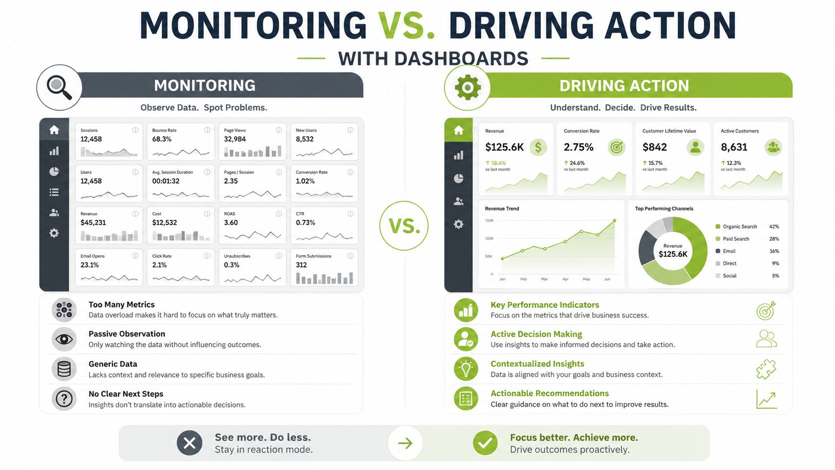
A practical redesign I've seen work is moving from one crowded page to three narrower views, one for teaching decisions, one for programme oversight, and one for platform health. That change does not just reduce clutter, it shortens meetings because each audience finally sees the figures it owns.
Privacy and Compliance in Educational Performance Data
Performance reporting in education carries a privacy burden that many teams underestimate. The more useful the report becomes, the easier it is to expose individual behaviour, especially when video activity, assessment results, and attendance are combined in one view. That's why reporting has to balance transparency with restraint.
Report enough to act, not enough to expose
For trend analysis, aggregate data is usually the safer starting point. Individual-level views are still useful for tutors, student support staff, and authorised managers, but they should sit behind role-based access controls and audit trails. The report should also show only what the audience needs to do its job.
The same logic applies to GDPR and FERPA contexts, even though local policies differ. Anonymisation, pseudonymisation, and aggregation all help reduce risk, but they work only if the underlying governance is clear. If a report is meant for departmental planning, there's usually no need to show learner-identifiable detail on the front page.
The secure handling of performance data matters just as much as the visual design, and how to ensure data security is a relevant operational check for teams managing video and LMS integrations. The point is simple, if the data feeds are sensitive, the reporting environment needs controls that match.
Practical rule: give each role the narrowest level of detail it genuinely needs, then log who accessed it.
A good compliance practice is to review whether the report still makes sense if names are removed. If it does, you're probably close to the right level of aggregation. If it doesn't, the report may be serving case management rather than performance reporting, and that needs a different governance model.
Real-World Applications and Success Stories
The strongest reporting setups I've seen all share one feature: they are built around a decision someone has to make. At one university, the reporting focus moved from generic video views to a clearer view of how students used recorded sessions, captions, and video assignments. That shifted conversations from “Did they watch it?” to “Where are they getting stuck?”
In corporate learning, the same pattern shows up differently. L&D teams often start with completion data, then realise completion alone doesn't tell them whether the course changed behaviour or improved performance on the job. When they add assessment results, time-on-task, and facilitator notes, course design becomes easier to adjust because the team can see which sections are absorbing attention and which ones are being skipped.
Technical reporting tells a third story. IT and media teams need a way to see whether slow delivery, playback interruptions, or live-session instability is coming from the platform, the network, or the endpoint path. The most useful dashboards make those distinctions visible early, so support teams can intervene before a frustrating issue turns into a full outage.
A platform such as MEDIAL can sit inside that workflow because it provides video integration with learning management systems, media workflows, and analytics support in one environment. In reporting terms, that makes it easier to connect teaching activity, media usage, and technical performance without pushing staff into disconnected spreadsheets.
The practical lesson is consistent across institutions. When reports are tied to a specific owner and a specific action, they stop being passive records and start shaping better teaching, cleaner operations, and faster support.
Your Implementation Roadmap for Better Performance Reporting
The fastest way to improve reporting is not to redesign everything at once. Start with one audience, one decision, and one dashboard that matters enough for people to use it weekly. From there, build the reporting stack in layers so the system stays understandable as it grows.
Build in the right order
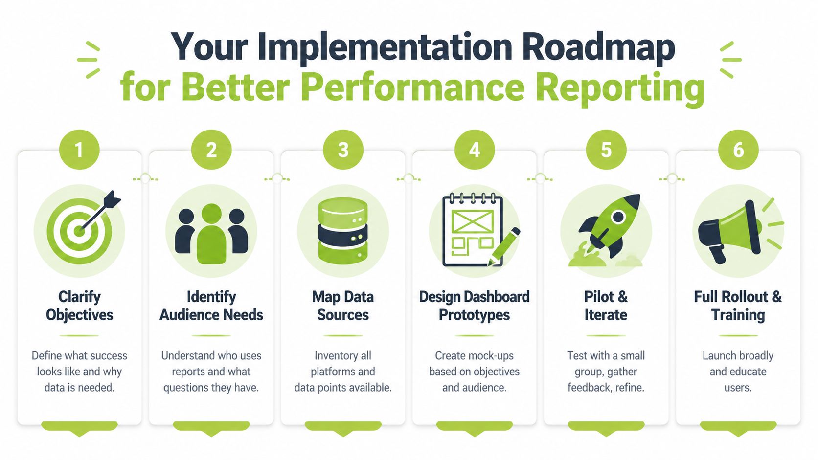
First, clarify the objective and write down what success looks like in plain language. Second, identify the audience needs, because instructors, managers, and IT staff rarely want the same level of detail. Third, map your data sources and decide which system owns each field.
Next, design a prototype dashboard with just the KPIs that support action. Then pilot it with a small group, gather feedback on what's unclear, and refine the layout before full rollout. Finally, train users on how to read the report and when to escalate problems.
A simple checklist helps teams stay honest:
Avoid metric sprawl: if a KPI doesn't support a decision, remove it.
Avoid one-size-fits-all views: different users need different thresholds and context.
Avoid isolated exports: build a shared data layer instead of endless spreadsheet copies.
Avoid unexplained gaps: if a goal wasn't met, state why and what happens next.
The organisations that get this right usually keep the first version deliberately small, then expand only when the audience asks for more. That's the opposite of how most reporting programmes start, but it's the more durable route.
If you want performance reporting that supports teaching, training, and media delivery in one place, explore MEDIAL. It brings video, LMS integration, and analytics into the same workflow, which makes it easier to connect learner activity with the technical and instructional decisions your team has to make.
Comments